1861: Williams Morris sets up what is known as the first
art-decorating firm.
Design for Trellis wallpaper, 1862
1880: The Development of the halftone screen allows for
the 1st photo printed with a full range of tones.
1890: The Art Nouveau movement begins.
The Peacock Skirt, by Aubrey Beardsley, (1892)
1917: James Montgomery Flagg designs the famous
“I Want YOU for the U.S. Army” poster.
1919: The Bauhaus, a German school, is founded, eventually providing the framework for modern design.
1940: First issue of Print Magazine printed.
1922- William Addison Dwiggins coins the term “Graphic Design”
1957: Max Miedinger designs Neue Haas Grotesk font, later renamed Helvetica.
1969: Douglas Engelbart develops first computer mouse, setting the stage for the future tool of graphic design.
19th-21st
Century
Influential Graphic
Designers
Graphic Design-1800's
Graphic Design: 1917-1969
1984: Apple releases the first Macintosh computer, featuring bitmap graphics.
1985: Aldus, formed by Paul Brainerd, develops PageMaker software.
Brainerd also coins the phrase “desktop publishing”. In the same year, New York firm Manhattan Design creates the MTV logo.
Mid-late 1980’s: The arrival of desktop publishing and
graphic art software applications is introduced.
1990:
Photoshop version 1 released, and physicist Tim Berners-Lee develops
the world wide web, along with HTML and the concept of website
addresses.
Mid 1990s-Current: The following programs are developed and become a important tool to modern designers:
Adobe Photoshop (a raster-based program for photo editing),
Adobe Illustrator (a vector-based program for drawing),
Adobe InDesign (a page layout program),
Adobe Dreamweaver (for Web page design). Another major page layout tool QuarkXpress (a product of Quark, Inc.,)
David Carson is most widely known for his anti-swiss (read: hap-hazard) style.
He places type and images anywhere on the page – over pictures, over itself, even up-side-down.
His work is certainly reactionary to the modernist era, but his
magazines, specifically Ray Gun, have become iconic and are still
praised for their originally.
David Carson-
Chip Kidd
Chip Kidd is a writer and designer & currently working in New York City
He primarily designs book jackets, & has worked for Alfred A. Knopf since 1986.
Kidd also designs for Pantheon, a subsidiary of Knopf, as an editor of books of comics.
In
1997, Kidd received the International Center of Photography’s award for
“Use of Photography in Graphic Design” and in 1998, he was made a
member of the Alliance Graphique Internationale
Kidd's Work:
In 1991 Scher joined Pentagram as Partner, developing identities,
packaging and signage for a variety of major clients including The New
York Times Magazine, Bloomberg, Target, Jazz at Lincoln Center, Madison
Square Park, Tiffany & Co., Citibank and The Public Theater.
In 1998 she was inducted into the Art Directors Hall of Fame and in 2000 she won the Chrysler Award for Innovation in Design
In the 1970s and 80s Paula Scher begun her career as Art Director
for CBS records, where she designed posters, ads and over 150 album covers a year.
Paula Scher
After
school, Bierut landed his first job at the prestigious Vignelli
Associates design firm, where he become VP of Design. He worked on
clients such as Benetton and United Airlines.
After 10 years at Vigenlli, Bieurt moved on to another world-wide industry giant, Pentagram.
On
top of creating work for for clients such as: Saks Fifth Avenue,
Brooklyn Academy of Music, Yale School of Architecture, Princeton
University, Guitar Hero, The New York Jets, he is also an advocate for
design: writing books on design, as a co-founder of Design Observer and
as a teacher/lecturer all over the world.
Michael Bierut
He began studying design at the University of Cincinnati College of Design.
He had his first internship with AIGA medalist Chris Pullman.
Michael Bierut
Casey's Work:
Jacqueline Casey (RIP)
Ruth Ansel
Casey's work acknowledges the influence of the Grid established by the post-war graphic design masters in Switzerland.
As
Director of Design Services many of her posters have been created to
publicize exhibitions organized by the MIT Committee on the Visual Arts.
She often uses strong elemental imagery, manipulated by letter forms.
Exhibitions
of her work have been held at MIT, at the Chelsea School of Art, London
(1978) and the London College of Printing. (1980)." A collection of 99
posters designed by Jacqueline S. Casey for events and activities at MIT
from 1963 to 1990 was donated to RIT in 1992 by the MIT Museum at the
request of Ms. Case
Casey passed away in 1992 after a long struggle with cancer.
Ansel also created film titles for numerous books and directed fashion
ad campaigns for Versace, Club Monaco and Karl Lagerfield.
Even
though Ruth Ansel worked as Art Director for the New York Times Magazine
in the 1970s and Art Director for House and Garden, Vanity Fair and
Vogue in the 1980s, those prestigious titles were only part of her
creative output during her career.
Jacqueline Casey trained at
Massachusetts College of Art before working as a fashion illustrator and
advertising, editorial and interior designer.
In 1955 she
joined the Office of Publications (Design Services Office) at
Massachusetts Institute of Technology (MIT) working with Muriel Cooper
who was then Design Director.
Graphic Design is an interdisciplinary, problem-solving activity which combines visual sensitivity with skill and knowledge in areas of communications, technology and business. Graphic design practitioners specialise in the structuring and organizing of visual information to aid communication and orientation(1). The graphic design process is a problem solving process, one that requires substantial creativity, innovation and technical expertise. An understanding of a client's product or service and goals, their competitors and the target audience is translated into a visual solution created from the manipulation, combination and utilisation of shape, color, imagery, typography and space.
Definition of a Graphic Designer One who has the artistic sensibility, skill and experience and/or training professionally to create designs or images for reproduction by any means of visual communication, and who may be concerned with illustration; typography; calligraphy; surface design for packaging; or the design of patterns, books, advertising and publicity material, or any form of visual communication(2).
Definition of a Communication Designer One who has the sensibility, skill and experience and/or training professionally to create designs or images for reproduction by any means of visual communication, and who may be concerned with graphic design; illustration; typography; calligraphy; surface design for packaging; or the design of patterns, books, advertising and publicity material; broadcast, interactive or environmental design; or any form of visual communication(3). Graphic Design - Job Descriptions
Owner, Partner, Principal An owner, partner or principal holds equity position and has major responsibility for a firm having employees
Design/Creative Directors A creative director or design director is the creative head of the firm, advertising agency or in-house design department and has final creative authority. Key responsibilities can include the development of graphic design, advertising, communication and industrial design
Art Director The art director establishes the conceptual and stylistic direction for all design staff and orchestrates their work, as well as the work of production artists, photographers, illustrators, pre-press technicians, printers and anyone else who is involved in the development of a project. The art director generally selects the suppliers and has final creative authority if there isn't any creative director on staff.
Design/Project Manager A designer manager or project manager manages the creative staff, evaluates its work, ensures that projects meet the requirements of the design brief and are completed on time and within budget. A design manager may work in a corporation and manage the hiring of design firms and the use of their design services.
Senior Graphic Designer The senior designer is responsible for the design solutions from concept to completion. In some firms, a senior designer directs the work of one or more junior designers, who generate comps and create layouts and final art. In some cases, senior designers do not manage staff, but are designated ‘senior' because of their authority in design decision making.
Intermediate Graphic Designer An intermediate graphic designer is responsible for the design of graphic applications such as collateral material, environmental graphics, books and magazines, corporate identity and branding, film tinting and multimedia interfaces, from concept to completion.
Entry Level/Junior Graphic Designer An entry level designer is a designer (see intermediate Graphic Designer) who has been out of College/University for less than two years.
Office Manager The office manager for a design firm takes care of the office administration and clerical functions, such as supply inventory, invoicing etc.
Print Production Manager A print production manager is responsible for managing the process (i.e. bids, scheduling, production and delivery) of producing publications, from concept through production, including photography, separations, four-colour press work as well as digital production. Print production managers are strong project managers, managing multiple jobs simultaneously.
Web Designer A web designer determines and develops the look and feel for web sites, and is responsible for site navigation, design and visual execution.
Web Developer A front-end develop uses HTML/javascript/ASP/ColdFusion and other tools to develop static and dynamic web pages.
Web producer/Manager A web producer organises web development teams and ensures adherence to budget, schedule and design of web site development.
Brand Strategist/Consultant Brand strategists combine business strategy with brand management expertise to ensure the creation of consistent, powerful brand experiences relevant to client' target audience(s).
Graphic Design Educator Graphic design educators transmit their skills and knowledge to students in post secondary design programs. They implement effective educational strategies through course and curriculum development, assessment methods, course management and liaison with industry.
Copywriter A copywriter writes, edits and proofs promotional or publicity copy for print or electronic publications. At higher levels, copy writers are often responsible for strategic and conceptual development of messages and stories.
Business Development/Salesperson A person focussed on new business development is responsible for developing client relationships, generating and following through on sales leads and closing new opportunities.
Operations Manager The operations manager provides leadership in the planning, organising, directing and monitoring of company business operations both on a day-to-day basis, as well as a long-term basis. Responsibilities include working with key stakeholders in the maintenance and improvement of productivity and quality systems.
The graphic design
professional evaluates and creates effective visual communication to raise the
client's image, product or service. Graphic design is implemented over the
broad range of visual communication, including magazines, books, websites, products,
packaging, corporate identity programs, logos, ad campaigns, brochures, press
kits and direct mail packages, to name a few.
The Design Process
The invention
process is driven by the client's needs. The graphic designer and the client
work together to identify and break the client's message and the best path to
enforce the message. A copywriter may be taken in the visioning process as
comfortably. The ideal end result is an instructive, persuasive program of
optical communication. Effective graphic designers combines artistic and
strategic know how with project management skills to produce merchandising
plans that produce results.
Customer Relationship
It is vital that
the graphic designer understand the client's demands and is able to make a path
to solutions. As part business consultant, the graphic designer must help the
customer see how effective graphic communication can create a consistent,
pleasing image of her line, enhancing the bottom business. The graphic designer
often coordinates with copywriters, illustrators, photographers and printers,
and invoices for the full parcel. Most customers will experience a specific
budget available for a particular task or set of tasks. A portion of the
graphic designer's job is to assist the client decide how to use his budget for
the best outcome. A successful architect-client relationship may hold out over
many years and help both parties develop their respective clientele.
A Changing Field
The graphic design
studio has undergone a series of rotations in the past two decades. The
technical side of graphic design changed from photo mechanical-based technology
to digital technology with the rise of the personal computer and graphics
programs created for graphics professionals. After design went digital, the
Internet took over much of the role traditionally taken by the print medium,
with website design becoming a major component of the graphic design arena. The
irony is that the purpose of the graphic designer has stayed much the same
despite the technical jump. The designer still must solve visual and marketing
problems for her guests.
A New Branch
Maybe the greatest
alteration in the traditional use of the graphic designer is dealing with the
peculiar attributes of designing for the Internet. Almost all effective
websites offer interactivity, and many include elements of living. For the
designer this means visioning effective visual communication incorporating
these components and becoming proficient using web design programs such as
Adobe Dreamweaver and Adobe Flash.
A role of Graphic design got so many categery example logos, symbol/icons, website, corparate stationary, book design, advertisements,broures, bill books, product packing,postes, greeting card and new media......
Logo
The dictionary meaning of a logo is a
symbol, sign, or emblem. Human beings have used such symbols throughout
time to convey a succinct message. In present times, logos tend to be
graphical in nature, designed for easy recognition of an organization.
It is a tool to build an identity for the organization, as part of its
trademark or brand, and to generate favourable thoughts and feelings
about the organization.
A logo needs to be original and memorable for the greatest impact.
Features of a Corporate Logo
A corporate logo should create a memorable association with a particular brand character.
It is the initial impression most people see of company, like the flag
of a country, but its impact depends upon how it is used. Its creation
needs to consider many factors, including the culture of the company it
represents.
Interesting and intelligent combination and use of shapes, colors, typefaces and other elements can create an image that is simple, yet bolrich with a concept synonymous to the organization.A logo is associated with the value of the brand, becoming a symbol of assurance and reliability.
Famous Logo Designers: 50 Greatest Brand Identity Designers in History
Being a right logo designer isn’t all about making pretty
pictures. That simply means you can simply design your ideas. A big logo is
memorable, timeless, durable and universal. It is the avatar of the character
and make-up of an organization, having the potential to cause or ruin its
reputation and profitability.
There have been several well-known people who revolutionized
the artistic creation of logo design and rendered a fresh dimension to
corporate branding and brand architecture by creating extraordinary work of breathtakingly
beauty and timeless elegance.
This page contains a list and biographies of some of the
greatest and most influential logo designers in history who have shaped our
visual universe. It is a fantastic resource to discover and understand the
giants – the famous logo designers – of the industry, giving the reader an
intimate glance into the creative minds and illustrious careers of iconic logo
designers.
You may explore this compilation of famous logo designers
and their creations and click through a specific designer to determine about
his/her life, work and achievements. We trust you see it as gratifying and
informative to read as we constitute it to collect.
The five expensive logo in the world
#1 Symantec – $1.28 billion
This is #1 from our world’s most expensive logos top list. But it is
kinda expensive, don’t you think? Chief marketing officer, Carine Clark
declared : ‘ We believe in today’s connected world that the Symantec
check mark will stand for confidence, the same way the Nike swoosh
stands for fitness. The new logo signals Symantec’s vision to bring
together identity and device security, information protection, context
and relevance and the benefits from leveraging the cloud – all critical
enablers of confidence in a connected world.’ The VeriSign check mark is
one of the most recognized marks.
#2 BP – $211 million
Another logo redesigned by Landor Associates in 2008. BP stands for
British Petroleum, and it is a British multinational gas and oil company
with the headquarter in London. It’s the 5th largest energy company by
market capitalization. So, it deserves a logo this expensive. The
Helios mark symbolizes the newly merged company. The logo is bright and
bold, with natural forms. It looks good in green.
#3 Accenture – $100 million
The logo of Accenture was designed by Landor Associates.
The logo is very simple, with a text. The angled bracket above the
letter ‘t’ signifies forward movement of the company into the future.
Accenture is an organization providing outsourcing services, technology
and management consulting, with 281.000 employees.
#4 Posten Norge – $55 million
This logo is so expensive. Posten Norge is a Norwegian postal
service. In Norwegian, ‘posten’ means the post or the mail. Founded in
1647 by Henrik Morian, this postal service has now a new logo. A more
expensive one! Communications director, Elisabeth Gjolme said: ‘We will
keep the name, but it brings a new symbol. The new Post-mark is a
modernization of the old logo, which, with its classic horn and royal
crown is something most people have a relationship with. – It was
important for us to keep some of the tradition in the new logo.’
#5 ANZ – $15 million
The logo was designed by M&C Saatchi for the price of $15
million. The 3 pieces reflect ANZ’s 3 core markets (Australia, New
Zealand, Asia Pacific). The human shape represents customers and staff.
But what is ANZ ? In case you never heard of it, ANZ stands for
Australia and New Zealand Banking Group and it is the largest bank in
New Zealand and the 3rd largest in Australia. Founded in 1835, ANZ
operates in 30 other nations.
1) In a computer's graphical user interface ( GUI ), an icon (pronounced EYE-kahn ) is an image that represents an application, a capability, or some other concept or specific entity with meaning for the user. An icon is usually selectable but can also be a nonselectable image such as a company's logo.
2) On a Web page, an icon is often a graphical image that represents the topic or information category of another Web page. Frequently, the icon is a hypertext link to that page. Typically, icons are gathered in one or two places on a page, either as separate graphic files or as a single image map .
3) Icon is also a lexical programming language, commonly thought to be an evolution of the SNOBOL programming language
4)Small pictorial symbol used in a graphical user interface (GUI) or in web documents to identify a file, folder, program, or device (such as drive, modem, printer). An icon is 'activated' by clicking on it with a pointing device to start an operation or to make a choice.
Design is the process of collecting
ideas, and aesthetically arranging and implementing them, guided by
certain principles for a specific purpose. Web design is a similar
process of creation, with the intention of presenting the content on
electronic web pages, which the end-users can access through the
internet with the help of a web browser.
Elements of Web Design
Web design uses many of the same key visual elements as all types of design such as:
Layout:
This is the way the graphics, ads and text are arranged. In the web
world, a key goal is to help the view find the information they seek at a
glance. This includes maintaining the balance, consistency, and
integrity of the design.
Color: The
choice of colors depends on the purpose and clientele; it could be
simple black-and-white to multi-colored design, conveying the
personality of a person or the brand of an organization, using web-safe
colors.
Graphics:
Graphics can include logos, photos, clipart or icons, all of which
enhance the web design. For user friendliness, these need to be placed
appropriately, working with the color and content of the web page, while
not making it too congested or slow to load.
Fonts: The
use of various fonts can enhance a website design. Most web browsers
can only read a select number of fonts, known as "web-safe fonts", so
your designer will generally work within this widely accepted group.
Content: Content
and design can work together to enhance the message of the site through
visuals and text. Written text should always be relevant and useful, so
as not to confuse the reader and to give them what they want so they
will remain on the site. Content should be optimized for search engines
and be of a suitable length, incorporating relevant keywords.
Creating User-Friendly Web Design
Besides the basic elements of web
design that make a site beautiful and visually compelling, a website
must also always consider the end user. User-friendliness can be
achieved by paying attention to the following factors.
Navigation:
Site architecture, menus and other navigation tools in the web design
must be created with consideration of how users browse and search. The
goal is to help the user to move around the site with ease, efficiently
finding the information they require.
Multimedia:
Relevant video and audio stimuli in the design can help users to grasp
the information, developing understanding in an easy and quick manner.
This can encourage visitors to spend more time on the webpage.
Compatibility: Design the webpage, to perform equally well on different browsers and operating systems, to increase its viewing.
Technology:
Advancements in technology give designers the freedom to add movement
and innovation, allowing for web design that is always fresh, dynamic
and professional.
Interactive:
Increase active user participation and involvement, by adding comment
boxes and opinion polls in the design. Convert users from visitors to
clients with email forms and newsletter sign-ups.
Toronto web design professionals create
excellent User Interface (UI) Design for a satisfying web experience.
They use critical planning and analysis for the design and they pay
attention to individual client specifications, converting the intricate
process into a simple and elegant piece of art.
CORPRATE STATIONERY
people
Every business has its own stationery set that is made up of
envelopes, business cards and letterheads. These are personally designed
to look creative and make a statement in introducing the company. It is
important that designs would match one another to maintain consistency
and create a more corporate look.
One of the most noticed parts of this set is the letterhead which
fully represents your company and message. This is where you place the
text that you are sharing to your reader. With this, you can easily
create a good impression on your client especially when you invest on
its design.
Even famous businesses and people would spend time to have their
personalized letterheads. You may be surprised at how they design their
stationery in a way that would fully describe their personality.
You may find it interesting to have a glimpse of what the top brands
and known icons use when sending mails. So, we offer you a quick
compilation of some letterhead designs that have been on the working
tables of famous names.
Great letterhead designs
Walt Disneyís Wonderful World of Color, 1961
The Star Wars Corporation, 1976
Adolf Hitler, 1934-1945
Albert Einstein, 1932
Helen Gurley Brown, 1971
Jackie Collins, 2002
Princess Diana, 1997
Marilyn Monroe, 1958
Muppets, Inc., 1963
Playboy, 1955
MTV Animation, c.1995
Sesame Street, 2007
7Up
Charles Schulz, 1958
Arnold Schwarzenegger, 1989
J. K. Rowling, 2009
Pixar Animation Studios, 2003
Amsterdam News
Ferry Porsche, 1974
William S. Harley, 1936
Paid, non-personal, public communication about causes, goods and services, ideas, organizations, people, and places, through means such as direct mail, telephone, print, radio, television, and internet. An integral part of marketing, advertisements are public notices designed to inform and motivate. Their objective is to change the thinking pattern (or buying behavior) of the recipient, so that he or she is persuaded to take the action desired by the advertiser. When aired on radio or television, an advertisement is called a commercial. According to the Canadian-US advertising pioneer, John E. Kennedy (1864-1928), an advertisement is "salesmanship in print."
How is a book designed? What do book designers think about as they turn
manuscripts into printed books? In this unique and appealing volume, the
award-winning book designer Richard Hendel and eight other talented
book designers discuss their approaches and working methods. They
consider the problems posed by a wide range of projects—selection of a
book’s size and shape, choice of typeface for text and display,
arrangement of type on the page, and determination of typographic
details for all parts of the book within manufacturing and budget
limitations.
As omnipresent as books are, few readers are aware
of the “invisible” craft of book designing. The task a book designer
faces is different from that faced by other designers. The challenge,
says Hendel, isn’t to create something different or pretty or clever but
to discover how to best serve the author’s words. Hendel does not
espouse a single philosophy of design or offer a set of instructions; he
shows that there are many ways to design a book. In detailed
descriptions of the creative process, Hendel and the eight other
designers, who represent extensive experience in trade and scholarly
publishing in the United States and Great Britain, show how they achieve
the most effective visual presentation of words, offering many examples
to illustrate their choices. Written not only for seasoned and novice
book designers, this book will fascinate others in publishing as well as
all readers and authors who are curious to know how books end up
looking the way they do.
A brochure or pamphlet is a leaflet advertisement. Brochures may
advertise locations, events, hotels, products, services, etc. They are
usually succinct in language and eye-catching in design. Direct mail and
trade shows are common ways to distribute brochures to introduce a
product or service. In hotels and other places that tourists frequent,
brochure racks or stands may suggest visits to amusement parks and other
points of interest.
The two most common brochure styles are single sheet and booklet forms.
The most common types of single-sheet brochures are the bi-fold (a
single sheet printed on both sides and folded into halves) and the
tri-fold (the same, but folded into thirds). A bi-fold brochure results
in four panels (two panels on each side), while a tri-fold results in
six panels (three panels on each side).
Other folder arrangements are possible: the accordion or "Z-fold"
method, the "C-fold" method, etc. Larger sheets, such as those with
detailed maps or expansive photo spreads, are folded into four, five, or
six panels.
Booklet brochures are made of multiple sheets most often saddle stitched
(stapled on the creased edge) or "perfect bound" like a paperback book,
and result in eight panels or more.
Brochures are often printed using four color process on thick gloss
paper to give an initial impression of quality. Businesses may turn out
small quantities of brochures on a computer printer or on a digital
printer, but offset printing turns out higher quantities for less cost.
Compared with a flyer or a handbill, a brochure usually uses higher-quality paper, more color, and is folded.
DATA FORM:https://answers.yahoo.com/question/index?qid=20080716022631AADoDgV
There is a peculiar comfort in a brochure. It's easy to feel that if you've got one, you've taken care of marketing. Or most of it, at least.
Brochures, then, are too often done "...because everybody has one," rather than as part of a thoughtful marketing plan.
A brochure, in this context, is a pamphlet or booklet that describes a firm, a facility or a service. It may be used to explain all or a segment of the firm's services, or how the firm functions in a particular industry, or addresses a specific problem.
Despite the values inherent in well-done brochures, there are some pervasive misconceptions that substantially undermine their very real value to sound marketing. Perhaps the most expensive misconception is that brochures sell -- that a prospective client will read a brochure loaded with glowing adjectives, and sign a contract as a result of it.
To assume, too, that people read brochures thoroughly and carefully is another trap. In fact, a brochure, no matter how attractive or thorough, is usually simply glanced at. It may be read in conjunction with other material, to get an overall impression of a firm. But it's rarely devoured like a novel.
There's a tendency to forget that publications strongly compete against one another -- and against other marketing literature -- for a prospective client's attention. Your brochure is rarely the lone voice in a wilderness. Nor can a brochure be merely self-serving, ignoring the needs of the reader. The brochure that sings the praises of oneself may fulfill egos, but rarely will it fill coffers.
For all that a good brochure can contribute to a marketing program, it's rarely the keystone of a total marketing effort, nor should it be. But as an adjunct to a marketing plan, it can be powerful.
The Power of the Well-Designed Brochure
In conjunction with other marketing tools, brochures...
· Are tangible, with staying power. They give dimension and weight to anything you say about your firm and capabilities.
· Can demonstrate a firm's most valuable asset -- its intellectual capital.
· Catalog and describe a firm's capabilities, facilities, expertise, or point of view, all in best light.
· Can supply valuable information, redounding to the benefit of the source.
· Give visual dimension to a firm. A well-designed, attractive publication implies a well-run, efficient organization.
· Give legitimacy to a new facility or service. A new practice in an existing firm, for example, becomes tangible to both its prospective clientele and the firm itself when it appears in print.
When is a Brochure not Indicated?
A brochure is distinctly contraindicated when...
· It's not part of a plan that delineates why it's being done, and how it's going to be used.
· There is no clear view of how it will demonstrate the firm's intellectual capital.
· There are better ways to accomplish the objectives set for the brochure.
· It can't be done with a professional and businesslike appearance. The Web Site
It’s now difficult to think of a brochure without thinking in terms of a web site. The two are different, of course, although the inevitable question is that if you’ve got a web site to carry your information, why do you need a brochure? Several very good reasons…
· People have to come to a web site to see it. You put your brochure in the hands of the people you intend to see it. Serendipity is great, but you can’t build a practice on it.
· A brochure is static. It stays what it is until you rewrite, redesign, and reprint it. Very expensive. A web site can be changed every ten minutes, if you like.
· You can’t see a web site without a computer.You can read a brochure on the subway.
· The content is different. The web site is more dynamic, constantly changing (or at least, it should be), and constantly updated. Its strength is in its immediacy. A brochure’s strength is in its constant, focused message.
And don’t think that you can simply put your brochure on your web site. Nobody will look at your site a second time.
The Basic Questions
Within the context of even the simplest marketing program, thinking about brochures should begin with the very basic questions...
· Who is our audience, and what do we want them to know, think, or feel after they've read my publication?
· What are we trying to accomplish with this publication in terms of the overall marketing program?
· How will the brochure be used in conjunction with other marketing tools?
· Will some other marketing tool better accomplish what we want the brochure to do?
· How will the publication be delivered?
· Understand positioning -- What is the one most important thing about your service that meets the most significant need of your prospective clientele? That position should be at the crux of your brochure – the guiding and impelling factor that drives the thrust of your brochure. (A classic example of how a position works was the sign in the war room during President Clinton’s first election campaign – It’s the economy stupid. It told the campaign staff that the economy was the primary concern of the electorate, and that every messaged, speech, or piece of literature must have that position as the driver.)
The answers to these questions will, in turn, focus the objectives of the brochure, and lead to developing a more effective document.
The format is dictated not by arbitrary choice, but by the role the brochure is to play in the marketing plan. Too often, the graphic designer is called in before the writer, and before the brochure's marketing role is defined. This subordinates the message to the design, almost invariably resulting in a visually attractive publication that diminishes or fails to serve the communications or marketing objective. In fact, be sure that the designer understands that the message is in the text, not the design. Let the text do its work.
Still, publications should be professionally designed, written and produced. Amateurism will say things about your firm that are unflattering and counterproductive. If appearance is not the primary factor, desktop publishing may be sufficient. But a brochure to rest on the desks of CEOs of prospective clients should not be home produced.
The art of writing a brochure is exactly that -- an art. But in writing brochures for a law or accounting firm there are some distinct considerations that can make the difference between a brochure that accomplishes your objectives and one that doesn't.
The thoughtful, and most useful, brochure for a professional firm must solve a major problem -- how do we describe our facilities and services in ways that differentiate us from our competitors, and at the same project quality? Ethics, of course, preclude comparison, which forecloses a classic marketing device.
One problem – one nagging problem – remains. How do you get the message across without using the same language that everybody else uses, and saying the same things that everybody else says? How do you distinguish one professional firm from another, when you can't use adjectives? No problem is more vexing than this.
That's the dilemma. With a product, you can make a distinction. You can make a claim, and maybe even prove that claim. "Our bulbs are brighter and last longer than their bulbs." Presumably, you can also say, "We do better audits, " or "We do better briefs," but you can't prove it, and who'd believe it?
What Works?
The answer is always emerging, driven by the imagination of marketing professionals, but we do begin to see some things that work:
· Clarify the objectives. Again. Clarify the objectives.
· Think positioning -- the guiding and impelling factor that drives the thrust of your brochure.
· Keep it simple. Don't try to say too much in one brochure. Make one point about your firm and make it well, and you're ahead of the game. Nobody, remember, reads a brochure like a novel, cover to cover. Let major points stand out for the skimmers. Go for the overall impression, and don't try to tell everything in one brochure.
· Focus. Limit the brochure to a single purpose. A service. A facility. A single problem and its solution. Omnibus brochures seem to be less effective than the single-purpose document. And always with the position in mind.
· Always have a plan to use the brochure effectively, before you start to write it. Know beforehand who your audience is to be. You have different things to say to different audiences. How you write anything is a function of who you're talking to, and no one statement is universal. Know how the brochure is to be distributed, publicized, used in both direct mail and personal selling situations. A brochure to be sent ahead has a very different point of view than one to be left behind following a meeting, as a summary or reminder, and to reinforce points made in person.
· Write about your solution or services as if you invented them, even if you know you didn't. It may be the first time your reader has seen that capability or solution delineated.
· The operative word, implied or in fact, is "you." Most brochures die when the first word is "we." Your brochure must be cast, invariably, in terms of the needs of the market -- what the prospective client needs, not what you have to sell.
· Don't tell the reader what he or she should think about your firm -- demonstrate it. Don't say "We become involved with our clients' business," find a way to demonstrate it. Don't say "We pride ourselves on service," find a way to demonstrate it.
· Don't expect the brochure to present an image -- if by image you mean a perception of your firm that's other than reality. If you don't like the way your firm is perceived by the market, don't try to change the perception by manipulating symbols -- it won't work. Rethink the business you're in, change the firm accordingly, and then write the brochure -- not the other way around.
· Don't cast your brochure in stone. The life of a firm brochure shouldn't be more than two years. If your marketing program works, and your firm grows, it will outgrow the brochure in less than two years. If the brochure is applicable to the firm and still current after two years, then your firm is in trouble. Even if you don't want to be larger in two years than you are today, there's going to be some kind of change and growth. If it doesn't happen, you're in serious trouble as a professional and as a business.
· The best way to describe who you are isn't by describing it -- why should anybody believe you? It's to demonstrate what you do, and how you do it differently. Use case histories. You don't have to use the client's name. You can always say, "A manufacturing company had an inventory problem arising from the vast number of small parts used in its product. Smith & Dale solved the problem by..." As the song goes, "Don't speak of love -- show me." The trick is to talk about what you've done, not what you say you can do. "I can leap a wall a thousand feet high" is nothing compared to "Here's a picture of the high wall I leapt and here's a picture of me leaping it."
· Borrow from corporate annual reports. In the attempt to get the reader's attention, corporate annual reports use a number of exciting devices and techniques. A round table of financial analysts discussing the company. The CEO interviewed. An illustrated first person narrative. Boxes and sidebars to depart from the narrative to discuss an important point, or to define an unusual concept.
· Deliberately try to be different. If everybody else plays a major scale, play a minor scale. If you said it this way last time, say it that way next time. Do you want to be read? Work at it. Clichés don't work. If you can't do more than clichés, save your money. Don't do a brochure.
· Purpose alters the format and text of a publication.
· Think carefully about illustration. All professionals seated at desks look alike. Use both your own people and client situations imaginatively. Appropriate graphs and charts can help.
· Be thoughtful about details. For example, how a brochure is to be distributed affects it's physical design. If it's to be mass mailed, postage costs are a major consideration. Odd shapes that use custom designed envelopes increase costs substantially. Consider, too, how long the publication will be expected to do its job. A brochure with an intended long life shouldn't have dated references.
· Work with professionals. Sure it looks easy. You know what you want to say about your firm. You know how big you want the pictures to be. But as effortless as the better brochures look, that's how hard it was to get them to look effortless. Conceptualizing a brochure that really says to your clients and prospects what you want to say to them is an art form, rooted in skill and experience. Designing a brochure is a skill that's as professional as yours, and the difference between a brochure that's a chore to get through (and so won't be read) and one that's as inviting as a chocolate cake is artfulness. Use a professional.
The artfulness in a brochure is derived from knowing beforehand what you want people to know, think, or feel after they've read it. The art in a brochure is getting people to really read it in the first place, and to accept what they've read as news, as gospel, as a point of instruction and interest.
A brochure, in a sense, is no different from any marketing tool. Properly used, it works. Improperly used, it not only doesn't help, but it lulls you into thinking that you're accomplishing more than you really are. Better to take the larger view; to develop the larger marketing context in which the brochure is a working cog.
DATA FORM:http://www.marcusletter.com/Brochure.htm
Difference and specification
Between flyers,
brochures, leaflets, pamphlets & newsletters
Flyers
A flyer is also rightly known as a leaflet or a handbill. A
flyer is one piece of paper, usually the standard size of 8 ½" x 11"
(A4). Flyers are best for small scale marketing, or when you have a
small region to cover. Flyers are a cheap way to get info out to a large
number of people.
This type of marketing piece is called a throw-away, because
they're handed out or hung in public places with the expectation that
some of them will only get a passing glance before being thrown away.
They are poorly printed on low quality paper and might be used to
promote a night club or pizza restaurant.
If you're going to hang up your flyer, you'll only print on one
side. If you're going to be handing out your flyer, you can print info
on both sides.
The purpose of a flyer is to offer a small amount of information for a limited time at low manufacturing costs.
Flyers are most often used for:
Announcements of events, especially concerts or club openings.
Product info, such as specs for a new car.
Fact sheets handed out at trade shows or conferences.
Brochures
Brochures are also known as pamphlets and are more expensive to
print. A brochure is generally a standard-size sheet of paper that has
been folded lengthwise two times to create four panels (bi-fold) or folded three times to create six panels (tri-fold).
Brochures are more complicated to print
because each panel has its own margins, its own photos and its own
headlines. Businesses create millions of brochures each year and
sometimes copywriters are even hired to just write brochure text.
Brochures
are opposite of flyers in the throw-away category: they're created
especially to be kept and referred to again and again. They're handed
out at the end of sales presentations, as take-away information at trade
shows and they're displayed in racks at banks, doctors' offices and
cash registers.
It's expected that only people that are interested in learning more about a product will pick up a brochure.
The purpose of a brochure is
To follow up after an initial sales contact.
To give more-detailed information than a flyer.
Brochures are used in direct mail campaigns as the follow-up to a postcard that was mailed out to generate interest.
Leaflet
A leaflet usually has a better design as a flyer, and they
are printed in color and on better quality and is cheap in any way
feel. It is also important to note that while printed flyers usually on
A6 paper is a little bigger and a brochure can be printed on either A4
or A5 paper. Due to the fact that a leaflet will be made with better
quality than paper flyers, it costs you more to print leaflets.
The purpose of a leaflet is
Handing them out to your targeted market to promote your prorduct, service, or organisation.
Inserting them in local newspapers.
Leaving them in popular places where people are likeley to take or see one.
To catch the attention of your prospective customers and to get your message delivered convincingly to them.
Pamphlets
A pamphlet is an unbound booklet (that is, without a hard cover
or binding). It may consist of a single sheet of paper that is printed
on both sides and folded in half, in thirds, or in fourths (called a
leaflet), or it may consist of a few pages that are folded in half and
saddle stapled at the crease to make a simple book.
In order to count as a pamphlet, UNESCO requires a publication
(other than a periodical) to have "at least 5 but not more than 48 pages
exclusive of the cover pages"; a longer item is a book
The purpose of a pamphlet
Pamphlets are useful in business communications.
To educate, inform, persuade, or entertain your intended audience.
To mobilise people to support your cause.
To advertise a meeting or specific event.
To popularise your slogans and messages.
Book
A book is a set of written, printed, illustrated, or blank
sheets, made of ink, paper, parchment, or other materials, usually
fastened together to hinge at one side. A single sheet within a book is
called a leaf, and each side of a leaf is called a page. A set of
text-filled or illustrated pages produced in electronic format is known
as an electronic book (e-book).
Books may also refer to works of literature, or a main division
of such a work. In library and information science, a book is called a
monograph, to distinguish it from serial periodicals such as magazines,
journals or newspapers. The body of all written works including books is
literature. In novels and sometimes other types of books (for example,
biographies), a book may be divided into several large sections, also
called books (Book 1, Book 2, Book 3, and so on). A lover of books is
usually referred to as a bibliophile or, more informally, a bookworm —
an avid reader of books.
Newsletters
A newsletter is one of the best ways to keep your name in front
of the eyes of your clients, your associates, and others that may be in
your target market. A newsletter allows you to show them that you are
more than just someone who is looking for projects to work on. And a
newsletter shows that you are willing to pass on information that will
help them run their own businesses.
Think about how many newsletters you read each week or month. Do
you enjoy getting and reading it? Do you find the articles and other
information in the newsletter helpful? Do you know who or what company
produces it? Read more about different types of newsletters.
DATA FORM:http://www.aart.us.com/marketing-materials.html
BILL BOARD
Billboards take two forms. The most common definition of a
billboard is an outdoor sign or poster you usually see on freeways,
highways and streets. A billboard is also an announcement of a sponsor
or sponsors at the beginning, middle or end of a radio or television
broadcast.
PRODUCT PACKING
CREATIVE PRODUCT PACKING
Caffeinated Energy Drink
Kitchen Sponge
Nike Stadium Shoe Box
Advertising Agency: Publicis, Singapore
Six Feet Under DVD Box
Fruit Juice Packaging
Designed by Naoto Fukasawa
Milk Carton
Designed by Julien De Repentigny & Gabriel Lefebvre
Anti-Theft Lunch Bags
Spooning The Yogurt
Designed by Cho Hye-seung
Tea Hangers
Designed by Soon Mo Kang
Expiry Date Milk Cartons
Designed by: Ko Yang
Flower Pills
Designed by Moon Sun-Hee
Coconut Water
Royal Tea Bags
Company: Donkey Products
Juice Queen Condoms
16. Fresh Label
This food label changes its color by reacting to ammonia given off by food when it is becoming spoiled.
Concept by To-Genkyo
Anti-Smoking Pack
Designed by R.J. Reynolds
Nouvelle Peau Cream
CD Bakery
Designed by York/Sheridan
Spark Laundry Detergent
Colorful and White Laundry Detergent
Help Remedies
Designed by ChappsMalina, Little Fury & Help Remedies
(No) More Sex
Designed by Robert Daniel Nagy & Mads Jakob Poulsen.
DATA FORM:http://www.boredpanda.com/creative-packaging-designs/
The 4 steps for deciding on a packaging:
A first good step is to do a market survey: look at what your competitors are doing (materials, shapes, colors)
Then, choose a type of packaging (and keep in mind there will be changes)
Find a local packaging supplier for a test on small quantities
Test and tweak until you find the right fit
What types of information need to appear on a product packaging?
Packaging is not only a box or an enclosure. Many extra information
have to appear on it. Your packaging has to be “marked” (symbols like
recycling or poisonous) and “labelled” (text, numbers…). Most of the
information is required by law, but it varies from a country to another.
The required information has one goal: informing your customer about
safety, health and environment. It’s important!
The way any product is packaged and looks on the store shelf plays a big part in whether or not shoppers will be interested in buying it. If the packaging looks drab and boring, shoppers will overlook the product on the shelf and pick up something else. There are several factors to creating successful product packaging.
Read more : http://www.ehow.com/facts_5072593_definition-product-packaging.html
The way any product is
packaged and looks on the store shelf plays a big part in whether or not
shoppers will be interested in buying it. If the packaging looks drab
and boring, shoppers will overlook the product on the shelf and pick up
something else. There are several factors to creating successful product
packaging.
A poster is a “public” piece of paper conveying information through
text (words) and/or graphic images (symbols or pictures). It’s usually
designed to be displayed vertically on a wall or window and is large
enough to be seen and read from a relatively short distance. Its main
target audience is the person walking by. A poster must convey its
message with immediacy and purpose, because people on the street are
often in a hurry.
Posters are sometimes huge and can be seen from a long distance and
may appear along highways (on bill boards) or on the sides of buildings.
Posters may also appear in much smaller versions, sometimes like a
postcard, and are called handbills. Whatever the size or shape, posters
have a job to do and that is to convey information.
Posters carry many kinds of information:
they may call the population to rally, revolt or celebrate (e.g. political or propaganda posters)
they may alert citizens to health hazards or the presence of other dangers in the community (e.g. educational posters)
they may announce the coming of a wonderful theatre, music or dance performance (e.g. marketing posters)
All effective posters must:
grab your attention
entice you to read the information they display
present the information clearly and fully, so that you understand what the poster wants to say
convince you to rally, revolt, take part, take precautions, be on the lookout or buy a ticket.
The marketing poster is an important tool in most campaigns to sell arts events to the public.
DATA FORM:http://www.artsalive.ca/collections/posters/whatisaposter.php?lang=en
TIPS TO DESIGN A POSTER
01. Find a focus
Find a good idea for a poster, or poster series - like this
one focused on cars in movies - and you'll already be halfway to a
great design
"Can a good poster should be a message or idea,"
says Jesús Prudencio, the illustrator/architect behind the fantastic Cars and Films
series of bills. "It must convey something and should extend to everyone.
"One of my passions is movies," Prudencio
explains. "I realized that there were many people making alternative movie
posters," he states, "but I strained to make another approach. I
desired to make a series, which I'm still playing and I hope to grow, but not
only legendary films, but also films that I admire and where cars are not
equally well known." It's a neat example of a personal project that can
bring forth just about serious cash (A3 prints are for sale for €21 each – and
great for film buffs).
Make an impact
"I like to watch the trends, but do not usually give
them to my designs," he sums. "I like minimalist design and
uncomplicated melodic phrases. I strain to conduct what I desire with a few
factors that establish an impact and cause a permanent message."
In other words, before you design a poster make sure you
have a proficient thought, then it will not just appeal to designers due to the
aesthetics, but will likewise appeal to fans through the focal point.
02. Be consistent with details
Consistency of detail is key to a great poster design
Prudencio's next piece of advice is especially important if you're
doing a collectable series - that details should be consistent.
"I'm primarily a graphic designer so I'm used to working with fonts,"
continues Prudencio. In the case of my Cars and Films project, the most
important aspect was obviously was the car.
"I chose the same font for the titles of all the series for
consistency. And I used a contrasting font for the detailed information
accompanying the car. But for me, just as important as the font is the
background color. The background colour I chose was based on what I felt
the film symbolized and what would combine well with the other
elements."
03. Choose references carefully
Not going for the obvious choices will help your poster design stand out
"I saw that there were many people making alternative movie posters,"
he continues "but I tried to give another approach. I wanted to create a
series, which I'm still working and I hope to grow, but not only
legendary films, but also films that I admire and where cars are not as
well known."
"My process for this project was as follows: I did a sketch and then
vectorised using Illustrator. My references were obviously the pictures
of the cars and watching the the movie. I didn't go into too much detail
– analysing particular frames – for example to see what was on the
label hanging on the chair of the Mr Bean car." It's about balancing
artistic interpretation with authenticity, in this case.
04. Have fun, but be tight on the details
A sense of fun married by attention to detail is a powerful combination
Sam Gilbey's stunning illustration work – particularly his recent
painterly interpretations of film characters for the likes of Virgin
Media – have brought him much critical acclaim within the poster design
world. He was recently commissioned by Picturehouse Cinemas to design
and illustrate a poster to promote a '90s action movie all-nighter
featuring Die Hard: With a Vengeance, Speed, The Last Boy Scout and Con
Air, as part of the Scala Beyond season, at the Duke of York cinema in
Brighton.
"Originally I was planning to do a collage-style piece, featuring the
protagonist from each film, but this was scuppered by the fact that
Bruce Willis in the star of both Die Hard: With a Vengeance and The Last
Boy Scout," he explains. "I then remembered reading once that Under
Siege, the Steven Seagal vehicle, actually began life as a Die Hard
script.
"Basically the wise-cracking heroes – and antiheroes – of so many
action films, and especially from that era, are pretty interchangeable. I
love the genre, and in way that's part of the fun, but I then figured
it would be fun to illustrate this literally, and have an action figure
with interchangeable heads."
Factually correct
"When creating an image like this, with such a clear inspiration
point, it's all about having fun with it, but making sure there are
plenty of interesting – and factually-correct – details in there," he
continues. "For instance, I included the actual guns from the films as
accessories, and of course the Con Air bunny had to be in there!"
For a promotional piece such as this aimed at true fans of a genre,
it's a great idea to put some in-jokes in there – thus confirming the
fans' knowledge and giving them a bit of a chuckle at the same time.
Advertisement
05. Balance the composition
Use a grid to ensure everything is visually balanced
"The core skill is learning how to balance a composition, and looking
at how the viewer's eye will - ideally - bounce around the image,
rather than being taken out of it," adds Gilbey. "That's no different to
creating any other artwork, but if you're including type as well, then
the challenge to weight everything just right can be tougher.
"Use a grid wherever there's a significant amount of type to include,
Other than that, it's about finding your own style, and then within
that, trying to find a way to tell a bit of a story with your image."
06. Balance type and images - but sometimes go crazy!
You need to know the rules. Then you can break the rules!
"Balancing the type and images is essential in that first up you want
people to notice the image," continues Gilbey. "But then, if the actual
event is of interest, the info needs to be easy to understand too.
"Of course restraint with type is normally advisable, but in this
case it was time to let loose. That said, it's all set in Garage Gothic,
so it's only the style that varies for the different areas of info."
07. Mix up your typography
Mixing fonts is tricky, but can give great results if you pull it off
Radim Malinic is one of the UK's best-known and established creative
forces. With clients including Acer, Arts Council England, BBC and The
London Film Museum, he is known for his incredible use of colour and
composition and his straining photo-montage work, but turns his hand to
just about anything. He recently completed this stunning poster to
promote the designer's talk at Montreal Meets 2013.
"This was a personal piece to promote the debut of my latest talk -
When Worlds Collide," says Radim. "I wanted to do kinda of a gig poster,
which was only available on the day/night of the event at Montreal
Meets Three.
Typography
"Ever since I'd discovered the font Graphik,
I wanted to use it and this was the right opportunity," adds Radim.
"Graphik possesses a beautiful combination of boldness and elegance.
"To illustrate the contrast, I used SF Movie Poster [a free font from dafont.com]
for the super condensed font. Then it was a question of mixing the two
fonts to find the right result." Be playful but considered is the
message here.
08. Spend a day with it
Go back to your design later and you'll see it in a new light
"Even though deadlines can be pretty tough, it always pays to spend a
day with the design," Radim continues. "Especially when you create both
image and type.
"This poster looked a lot different the night before I finished. The
overall design can become better and more complete." It's essential to
do this for any design - not just a poster - and if you can try and get
some feedback from your peers as well.
09. Theme = composition
"The backbone of my presentation was about stepping into the
different worlds of interest and adding them to the our creative
worlds," adds Radim. "Therefore I wanted a focal point, albeit a bit
abstract, to be a huge letter W which is fragmented to symbolise
everything that goes on within one discipline. The other coloured
fragments represent the outside influences.
"Before print supply, I added white border within the canvas to make
elements 'spill' out, to once again emphasise the crossover of ideas and
styles." The lesson here is to draw your composition ideas from the
theme your design around."
DATA FORM:http://www.creativebloq.com/print-design/how-design-poster-pro-tips-7133634
GREETING CARDS
Background
Greeting cards are pieces of paper or cardboard upon which
photos, drawings, and a verse of cheer, greeting, celebration, condolence, etc.
have been printed or etched. Greeting cards are embellished with a mixture of
images and include messages to appeal to diverse audiences, sentiment, and
occasion to be called back. Greeting cards are easily prepared at home using
pen and paper or software sold by greeting card and other societies. Lately,
virtual cards that include pictures and verse can be transmitted to someone by
way of the Internet and e-mail and may be printed out on paper by the
liquidator. Despite the electronic accessibility of these cards, the greeting
card industry remains to sell cards in retail shops in vast numbers. Over 1,500
greeting card manufacturers sell an estimated seven billion cards each year. Each
family has an average of 80 cards annually.
The market research associated with the growth of a
successful greeting card is hardly as important as attractive graphics or
appropriate verse. Research has pushed large greeting card companies to expand
traditional product lines and offer cards for pets, step-siblings, divorce,
weight loss encouragement, company layoffs, and more. Some smaller greeting
card companies specialize in the production of cards that appeal just to single
or two specific markets. Greeting card companies take a diverse talent pool in
order to produce commercially-successful product, and these firms employ
everyone from cartoonists to market researchers to pressman who print the
cards.
History
Some speculate that the ancient Egyptians may have recorded
greetings upon papyrus and sent them via messenger to the intended parties, and
it seems plausible that the ancient Greeks recorded sentimental verse on
scrolls, as well. By the late Middle Ages, letters and messages of love,
including romantic verses sent near St. Valentine's Day, were exchanged
throughout Europe. Personal messages of greeting and sentiment were
individually crafted until the mid-nineteenth century. The first
commercially-produced greeting card was a Christmas card invented in 1846 by
British businessman Henry Cole who asked a printer to produce a printed
Christmas greeting he could quickly send to friends. The idea caught on and
mass-produced Christmas cards were popular by the 1860s. Louis Prang, an
American printer who invented a multi-colour printing process called
chromolithography, fashioned beautifully collared cards by the 1870s. Cards for
Easter, birthdays, baby arrivals, etc. soon followed. The larger American card
companies were founded in the early years of the twentieth century and a number
exist today and remain leaders in card sales. Innovations in card production
have primarily revolved around developing efficient printing methods,
diversifying the product offering by nurturing a great creative talent pool,
and devising more efficient point-of-sale displays so consumers can easily
examine the products in an attractive presentation.
Raw materials
Greeting cards are made of card stock that may be of wood
pulp or part "rag" (textile waste) —tough, fairly expensive paper. Progressively,
these card stocks are being built with reprocessed fabrics. Many, but not all,
of the companies put a glossy aqueous coating consisting of urine and a
water-based acrylic coating on the stock after printing particularly when a
photograph is featured. Inks vary as well. Many societies are acting toward the
usage of soy inks, containing water-based solvents and are more easily cleaned,
reused, or disposed of than oil-based solvent inks. Soy ink composition varies
with the printing process; cards are most often printed using sheet-fed
printing and the soy ink for that includes between 20%-30% soybean oil, resins,
paints, and waxes.
The Manufacturing
Procedure
The manufacture of greeting cards varies greatly depending
on the size of the pot. Successful greeting card companies invest a heavy deal
of importance on business research, merchandising, and creative design because
these help determine what cards will sell easily.
Research and marketing
More often than
not, before the artists and verse writers begin to set pen to paper, large
companies support in-house researchers that learn all they can about potential
buyers. These researchers find out all they can about consumers' wants,
demands, and business organizations that can be spoken in a greeting card not
already in production. The researchers use statistical analysis, market
research, and research on lifestyle modifications. Formerly the Research
Department has an estimation for a new card line, they utilize focus groups,
surveys, and controlled store tests to estimate the potency of the fresh
merchandise. For example, research may indicate that changes in the American
family call for cards that acknowledge step-siblings, or suggest that soaring
numbers of cat owners will lead to a successful line of cards offering sympathy
on the death of a pet.
The card design that started it all
Smaller greeting
card companies sometimes contract designers to supply sketches and ideas they
feel will be good sellers and fit their niche markets. Withal, in larger
fellowships, the Research and Marketing departments work closely with the
Creative Department in order to collaboratively devise a fresh circuit board. These
larger companies hire an in- house creative staff that includes artists,
graphic designers, photographers, authors, editors, and copywriters. This staff
provides the illustrations and verse featured in the product. The Creative
Department "marries" the survey to the appropriate verse and creates
a hand-made card. Once the Marketers and Researchers are pleased with these
mock-ups are examined and ranked by consumer panels or focus groups. The
prototypes deemed most marketers are then run into technical production.
Graphic design and production
Preparation
When the patterns
are approved to for production, graphic artists and technical production
assistants are key to translating original artwork and scrawled words into a
pleasing, coordinated product that can be batch produced. Thus, graphic
designers might re-size artwork to make it fit a card, add colour underneath or
on top, combine images with appropriate typefaces for the verse inside, etc.
The graphic designers must understand the capabilities of the printing machines
and use only those numbers of colours that can be successfully and economically
printed. Artwork, transparencies, etc. and verse are united in a mock-up that
is approved for further development. When approved, all the specifications for
the approved card—everything from the illustration on the front to the verse
inside to the UPC code and price on the back—are scanned or input onto a
computer disk and sent to the printer.
Producing the printing plates
The printing
process in controlled digitally. In the most modern printing facilities, plates
are created directly by exposure to lasers. A computer disk has
"recorded" the image to be reproduced. A plate is run through a
machine in which a computer is used to direct lasers to burn an image onto the
metal plate. Each colour requires its own printing plate and the computer disk
is programmed so that it outputs plate specifications for each individual colour.
It is most economical to print no more than four colours on a card; thus, in
most cases a disk produces four plates per card. The plates are now ready to
print.
Printing the cards
It is important to
note that before an entire run of cards is processed, a couple of examples are
run off and submitted for "proofing." The designers, marketers,
graphic artists, press operators, etc. examines the card and check it carefully
to ensure the imprint is of acceptable quality. Minor color corrections or ink
adjustments occur before the print run can proceed. When the proof receives the
sign-off, mass-printing begins. Greeting cards, often printed in runs of
400,000 or more, are often printed using a sheet fed offset printing that
permits the printer to print between 4,000-18,000 sheets per hour. When ink and
a fountain solution (water with chemical additives) apply to the laser-burned
metal plate in the right proportion, the image to be printed accepts ink but
repels the fountain solution. The non-image (white or background area) attracts
the fountain solution and repels the ink and is left unprinted. From the plate,
the image is applied under pressure to a rubber canvas called a blanket. From
the image is then transferred onto a sheet of paper. The sheets of paper to be
printed, about 20 x 35 in (50.8 x 88.9 cm), are put on the press mechanically.
The press grabs a single sheet of paper at a time, generally printing all of
the black images and words first, then moving quickly to the next metal plate
(which applies a different colour of the design) without allowing time for
drying the just-applied inks. While on the press, an aqueous coating (that
provides shine) is applied to the just-printed card by another plate. The cards
then air dry for approximately five to six days.
Cutting apart and packaging
After the sheeted
cards are completely dried, they are cut into individual cards from the larger
sheet by a die cutter. The sheets are inserted into the die cutter and an
apparatus that resembles a cookie cutter cuts them apart in one stroke. The
cards are now a long strip that is yet unfolded.
The card is then
sent to the folding machine where it is creased and folded automatically. Cards
are often packed by hand and assembled with their envelopes in carton
quantities of 700.
Quality Control
The production process is carefully monitored. There are at
least two submissions of proof copies to the product development teams—before
the product is put into disk and then at first printing—to ensure the product
is designed as was envisioned and can be printed to quality specifications.
Pressmen check colour, inks, and completed sheets throughout the printing
process. The die-cutter is able to watch the process and makes sure the cutting
is done correctly so that straight clean cuts are made. Finally, the folding
machine operator monitors the quality of the completed card. He or she is able
to now see the card completed and ready for sale; this person has the
prerogative to pull inferior cards (poorly printed, badly cut or folded) out of
the line and jettison it.
By products/Waste
The role of soy ink has greatly decreased solvent disposal
problems for the printer. Soy ink does not publish a substantial mass of
volatile organic compounds (VOCs) into the air when it dries. VOCs are chemical
compounds that evaporate and react in sunlight and form smog at lower
atmospheric layers. Soy ink is not 100% biodegradable, but it is far more
biodegradable than oil solvent-based inks. Furthermore, soy ink is more
effectively removed from the papers during recycling, resulting in less paper
damage and a brighter paper. The role of soy ink helps printers meet the
federal Environmental Protection Agency's clean-air measures. Waste papers are
generally recycled by the printer as easily.
The Future
The future of greeting cards seems strong, with circuit
board sales for single company alone reaching nearly $4 billion last yr. Still,
two very recent developments may affect the future of the greeting card
industry tremendously—perhaps adversely. The inaugural is the software
available that permits consumers to make their own greeting cards (with the
assistance of easy-to-use programs) using a personal data processor and a colour
printer. Some card manufacturers created this software for sale; so, they see
profits when the software is purchased, but it may cut back sales of store-bought
cards. The second evolution is that anyone with Internet connections may send a
free cyber card that can be read off of a site and sent via e-mail. They may be
held through any one of dozens of websites, require no postage stamp, and may
be transported in an blink of an eye. In summation, many such cyber cards
feature sound, music, and life. Even the big card companies provide such cards
and they are often free-of-charge. It stays to be determined whether the new cyber
card will affect over-the-counter sales of paper greeting cards.


 Read more: http://www.businessdictionary.com/definition/advertisement-ad.html#ixzz37udqnnQr
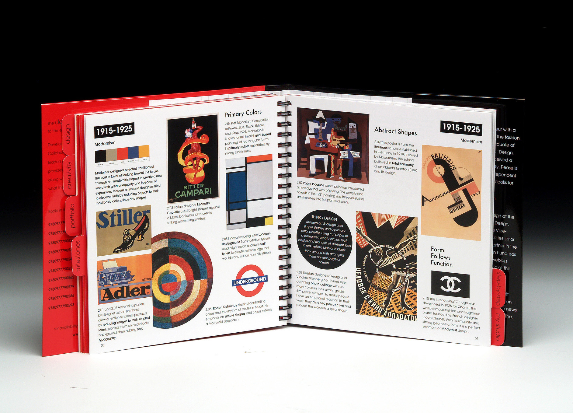


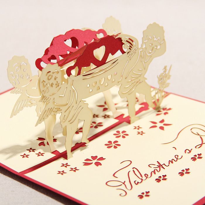
